What Do We Mean By 'Accessibility' on Shopify?
Picture this: a library full of your favourite books. The ability to travel to worlds of fantasy, science fiction and horror, all from one place. But now imagine this vast space only being accessible via a staircase, deeming it inaccessible for those unable to use stairs.
It doesn’t just happen to those in the physical world - it also happens in the digital space. Both are places where everyone should feel welcome, and considering accessibility helps you achieve this.
Accessibility within digital is as important as accessibility in real physical spaces. The websites and apps we use in our day-to-day lives can be crafted by designers in such a way as to create a user interface accessible for most. We say ‘most’, as it is not always possible to be fully accessible to all. Keeping all disabilities in mind when designing, developing and content writing can be hard, however it is something that everyone should strive for.
There are a whole range of disabilities, however when it comes to what we typically face as designers, there are four main categories:
- Visual - including blindness, people who are colour blind, with epilepsy and more
- Auditory - those who are deaf or hard of hearing
- Motor - amputees, people with paralysis and more
- Cognitive - Down’s syndrome, Alzheimer’s disease, dyslexia and more
What’s the Importance of Accessibility on Shopify?
More than 7 billion people are alive today and 1 in 7 have some form of a disability. That’s a huge amount of users that are at risk of being neglected if accessibility is not considered carefully: 1 billion users. It’s easy to make this group feel included. Improving your Shopify site's accessibility can go a long way to doing this. Improving the experience for all your users will enable them to shop with you, increase your online visibility, and in turn increase your conversion rate and revenue. While implementing accessibility improvements can be a long process, it’s really not hard to be inclusive and, in fact, being accessible should come naturally.
It’s also worth considering that Google includes accessibility when they are indexing sites and assessing performance.
How To Improve Accessibility for Ecommerce?
Measurement
The Web Content Accessibility Guidelines 2.0 (WCAG 2.0) is an organisation that all websites across the world should adhere to. There are a whole host of small changes and standards, and it may seem like there is a lot to do across your site to accommodate the principles for each country.
While it looks overwhelming at first, our advice for the approach is to break the work down into chunks to complete over a period of time, and tackle the tasks in a way that doesn’t harm your user experience. Never throw in the towel though.
Contrast
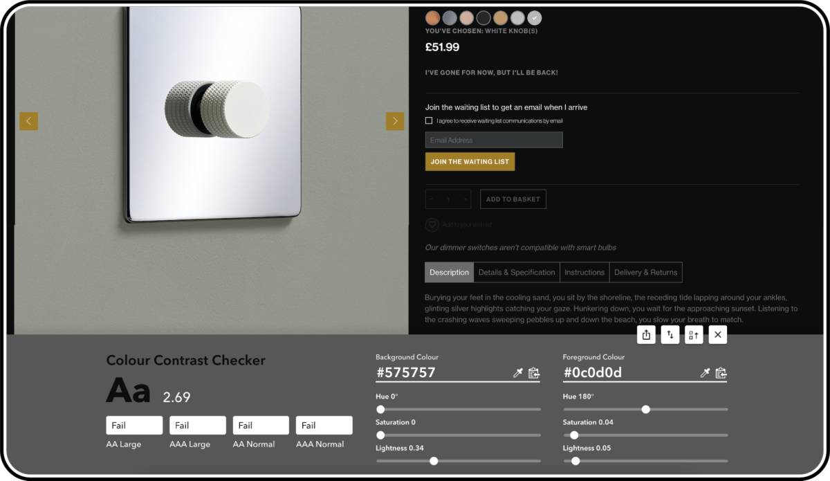
This refers to the contrast between elements of your Shopify site, which could apply to text on a background, for example. Making sure the contrast is correct will be beneficial to users with low vision, low screen quality or those who struggle to read.
There are three recognised types that WCAG refer to as standard:
A, AA and AAA
AA is the recommended minimum standard, but AAA is what we all try and strive to achieve when it comes to colour contrast. There are many tools to use to check check colour contrast and in design, there are free plugins for Figma.

Colour
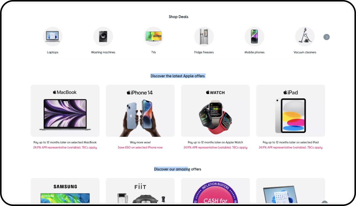
Colour, when used correctly, can aid how users differentiate between graphic elements, collections and states. Those who are colour blind are unable to rely on colour alone, so we need to consider alternatives to relying on colour to design and distinguish between objects and elements.
Evolving our understanding of this and implementing changes is much easier than you may think. A combination of colours and labels can improve the experience. Take Monday.com for an example - when changing the status of an item, there is a colour that represents the status for quick visibility, but for those who may not be able to use the colours effectively, we also have the text status.

Alt Tagging
Users that are either blind or visually impaired normally use screen reading apps in order to navigate around a website. These tools map the site's content using Accessibility Trees. These trees are used to help those individuals around the site by reading the content aloud.
When it comes to ‘alt tagging’, this refers to text descriptions of images used on websites. These short descriptive texts allow those who are visually impaired or blind to hear what the images show. Importantly, alt tagging images is also helpful from an SEO perspective and can improve the overall value of the site in Google’s eyes.
Shopify Stores Utilising Keyboard Accessibility
Keyboard accessibility is one of the most important aspects of web accessibility. Many users with motor disabilities rely on a keyboard. Some people have tremors which don't allow for fine muscle control. Others have little or no use of their hands, or no hands at all. In addition to traditional keyboards, some users may use modified keyboards or other hardware that mimics the functionality of a keyboard. Blind users also typically use a keyboard for navigation. Users without disabilities may use a keyboard for navigation because of preference or efficiency.
All functionality must be usable with the keyboard. That is, users can access and move between links, buttons, forms, and other controls using the Tab key and other keystrokes. Websites should not require a mouse; for example, pop-up calendars should also let users type in a date.

Text Labels For Field Fills
Label text is used to inform users about what information is requested for a text field. Every text field should have a label. Label text should be aligned with the input line, and always visible. It can be placed in the middle of a text field, or rest near the top of the container. Content is King
Without content, your site would not exist. Whenever writing and producing content for your Shopify store, accessibility needs to be considered too.
Making sure that all users are catered for, including: those with a disability like dyslexia; the young who have not yet developed a broad vocabulary; and older generations who are not as nimble or technologically savvy. Sentences still need to be structured for all to understand quickly. Provide your users with a quick understanding of who you are and what you’re trying to convey. Give users what they need and stick to the point.
So, Should Your Shopify Site Be Made Accessible To All?
A resounding yes. It’s bad practice to exclude users, primarily because it’s better to be inclusive in a general sense, but also because you’ll miss out on vital traffic and sales if you prevent some of your audience from exploring your Shopify store and buying your products. Colour, content and contrast are good places to start, and an accessible site alongside a great user experience will encourage more visits and sales.
Where should you start on finding out what you need to do to become more accessible? First you should untertake a full accessibility audit. It’s a great way to identify what you’re doing well and where you need to improve. At Eastside Co we can help with that. We have a dedicated team of UX designers, developers and SEO experts who can audit your site and help you on your journey to accessibility.
Contact us today to find out more about how we can help.


