Brand Creation
Brand Development Strategies
We create ecommerce-ready brands by working digital first, ensuring you stand out and resonate on the platforms that matter in the mediums that work. We craft your visual language and tone of voice from the smallest possible interactions through to the broad ecommerce experience - so that you can engage and convert your audience online.

Force Fitness
Force Fitness helps crossfit athletes achieve more than they ever thought possible. Everything they do offers them the opportunity to believe that with the force of mind and body, they can go beyond themselves.
Building on this intent we helped the founders establish a reason to believe in the brand: that breaking through barriers requires a dual force - force of mind, and physical force. Together the immovable is moved and the unachievable is achieved.
We capture this sense of force and movement in the naming strategy and brand language that is as vibrant and challenging as the Crossfit culture they live in.

Milk Electric
In a market dominated by national retailers with very little product differentiation or brand recall, Milk wanted to shake things up and stand out from the crowd when establishing itself as the destination for premium electric scooters in London.
We created a brand approach that set Milk as the secret ingredient that makes the ride enjoyable. Establishing a minimal but colourful visual language alongside a copy platform that communicates the brand concept and points of difference – Milk: it’s in the ride, it’s in the service, it’s in the membership.
In addition we advised and defined product strategy, establishing a collaborative approach and applying colour as a unique identifier in a market that is otherwise dominated by bland black products.
The resulting brand language is refined for the premium market and established clear meaning and reasons to believe.

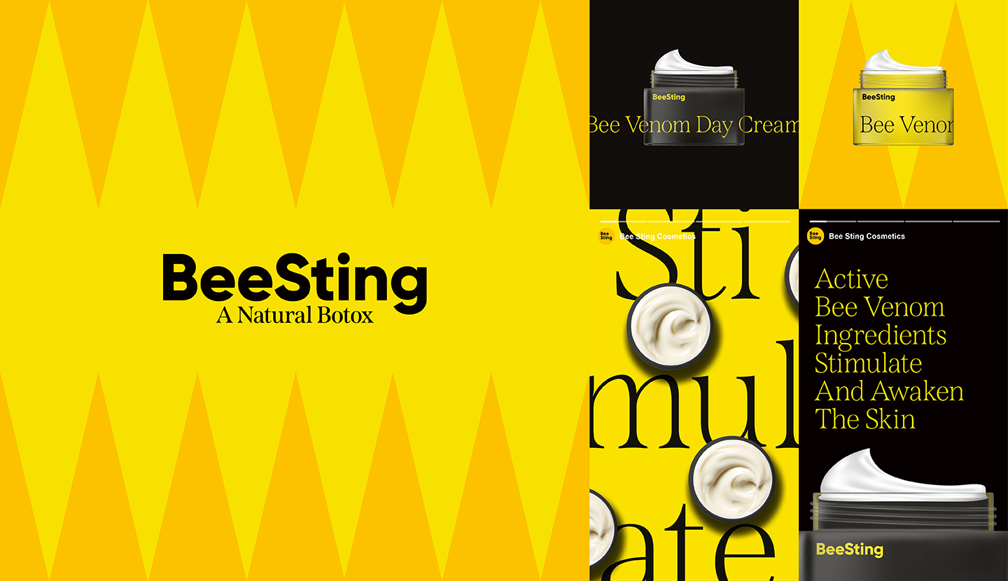
Bee Sting
Bee Sting’s skincare products contain active bee venom ingredients to stimulate and awaken the skin back to its best – and they wanted a brand that would be equally active and engaging.
Our approach was heavily influenced by the bee USP. With the unmistakable black and yellow colour at the core, we created tonal colour extensions to bring the brand to life with a stinger pattern, expressive typographic system and one-dimensional photographic styling.
The digital-first brand language creates an eye-catching playoff of scale and positioning, creating a new sense of depth and intrigue with animation and movement at its heart.

