
REN Skincare
Services
- Bespoke Shopify Plus Build
- Optimised for Conversion
- 3 International Stores
- Improved UX
Brand Overview
REN Skincare is an ethical skincare brand, with a reputation for clean, environmentally friendly products, and bio-actives that only benefit the skin. The brand delivers exceptional skin care products that you can feel comfortable using on your own skin, and not have to worry about the environmental impact. Using 100% recyclable packaging, refillable containers and rejecting harsh, controversial chemicals and toxins, REN is a brand that customers can feel good about using.


REN
The Brief
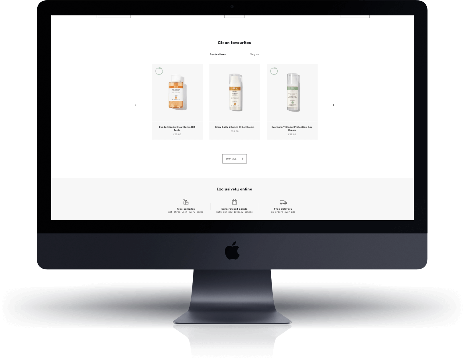
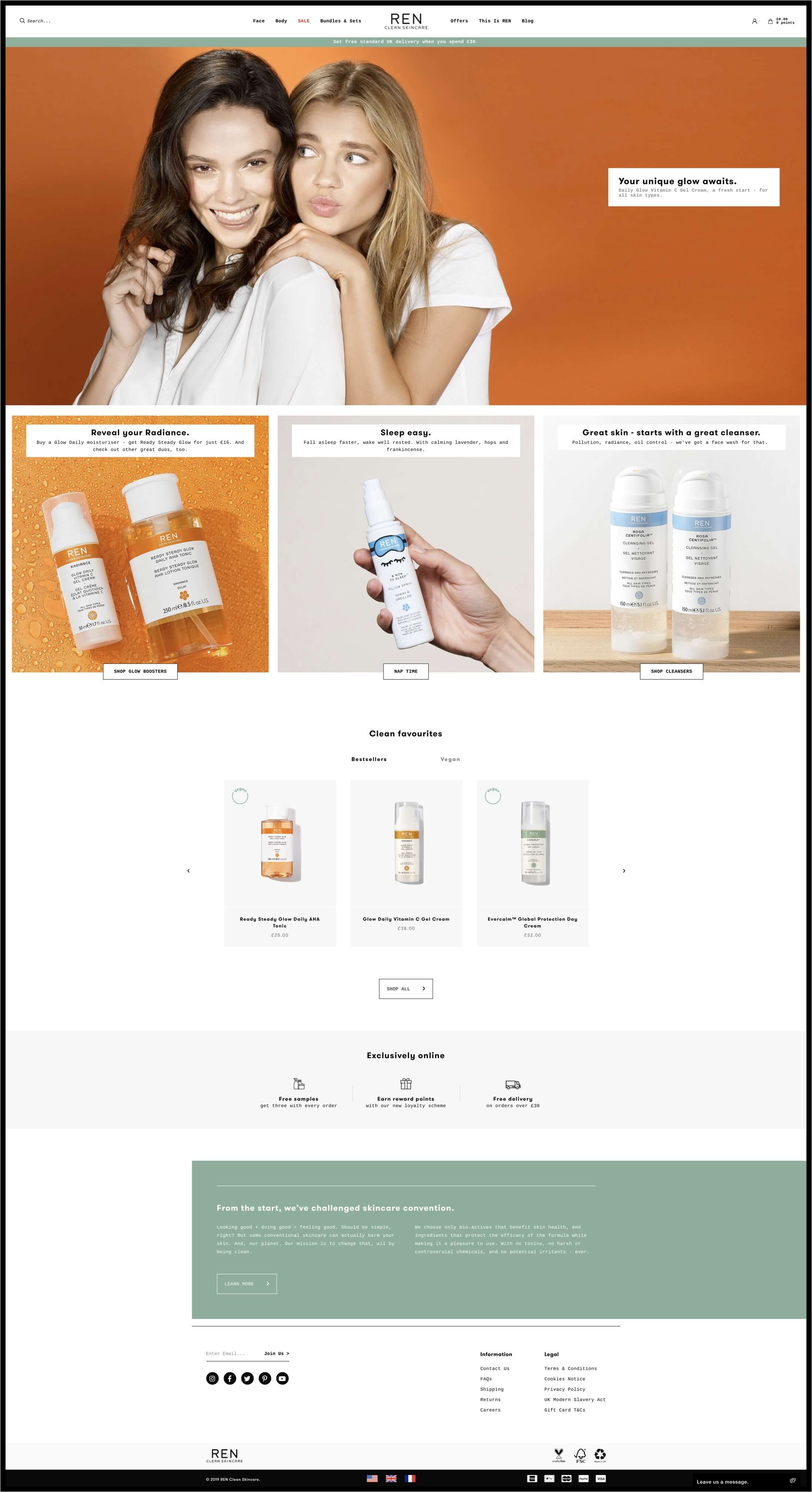
REN Skincare was looking to redesign and develop its website in order to better reflect the clean branding and clean products on its UK, US and French sites. The new design needed to raise the standard of user experience (UX) across the whole site. REN Skincare’s aesthetic is simple and sophisticated, and the customer’s user journey needed to reflect this on the site. Conversions were also a priority to REN, and this was the natural result of the detailed UX improvements on the site. Ultimately, the site is simple and user friendly, creating the perfect user experience, and increasing the chance of happy customers converting.
REN Skincare also needed additional stores to service its French and American customer base.


Our Approach
For REN Skincare’s requirements, Shopify was an obvious solution. 99.99% uptime was important for a brand that already has a returning customer base and the infinite scalability was necessary for REN’s rate of growth. The site was designed to reflect REN’s clean aesthetic, branding, and ethos.
It was important to REN to have the full range of skin care products displayed across the site, and that the customer journey was as seamless as possible.
Conversion Rate Optimisation (CRO)
Increased conversion rate was a core requirement for the new REN Skincare site, and this went hand-in-hand with the user interface and user experience upgrades. Clear product photography on collection pages gives customers exactly what they are expecting to see - along with descriptive product titles and quick add to cart buttons, making it as easy for customers to purchase as possible.
This is complemented by the REN member’s area, which nurtures returning customers. The site is built so that repurchasing products customers already trust and enjoy is as easy as possible. This goes one step further on product pages, with additional lifestyle photography showing the product in use, along with clear and detailed information on ingredients and application.


Results
REN Skincare is all about ethics and simple, effective products, so it was essential that the website provided a clear and natural experience. Stripping back the member’s sign up section on the homepage was important for ease of use - making this experience easy for customers increased the chance of data capture and cleaned up the homepage. The navigation was also simplified to allow customers to browse the site intuitively.
Collection landing pages were introduced into the navigation so that customers are sign posted around the site naturally. Finding the exact product you are looking for onsite takes no more than two clicks. Reducing the number of steps a visitor needs to take to get to the shopping cart streamlines the process and reinforces the great customer service.
The site has no UX rabbit holes (journeys that end in a customer getting stuck on a particular page, without an obvious way out). This reduces a customer’s chance of bouncing off the site whilst continually showing related products and additional helpful content.


