
One thing that will drive customers away from your site, your products, and will divert their attention to your competitors is bad UX.
User experience (UX) is the journey a customer takes through your website. A good customer journey - a great user experience - is the key to customers converting. You want your website to be easy and intuitive for your visitors to navigate. Streamlining a seamless shopping experience means that the customer won’t hit any speed bumps on the way through your site and won’t find any reasons to leave before making a purchase.
As soon as a customer finds a reason to leave your website, they will - it’s much easier to choose the path of least resistance than it is to muddle through a badly designed website.
Be the path of least resistance.
What is a Heatmap?
Heat mapping shows you where the ‘hot’ parts of your webpages are using visual data, with the hotspots being the areas on pages that your customers are spending most of their time.
It shows where visitors move their mouse cursor, where they scroll, hover and click. As well as highlighting positive actions, it can show you areas of inactivity, for example calls to action or links that aren’t being clicked on.
To be able to make any accurate hypotheses about what the heat map is showing you, you need a decent sample size - the data from 25 visitors isn’t enough to make any inferences about what the data is telling you. We’d recommend looking at heat map data from at least 2,000 visitors to a given page. It’s also important to split your results per device - so evaluate the results from desktop visitors separately to what the heat maps from mobile visitors are telling you.
Using a heat map allows you to track how customers are using your site. It can’t be overstated how valuable this insight is. There are several types of heat map to talk through:
Hover maps
These maps show where visitors have hovered on a page with their cursor. The idea is that people often look where they hover so this can give an indication of how people are reading through a web page. It’s a primitive version of eye tracking, with the obvious limitation that it’s actually following the mouse cursor, not the person’s eyes. It’s worth considering hover maps to get an overview of how people are moving their cursors around the page, as long as you’re aware of this limitation.
Click maps
These aggregate users’ clicks to generate a heat map in which areas with higher click density are ‘warmer’, with areas cooling relative to the number of clicks. This kind of information is arguably more useful than the hover map.
For example, if you see that lots of people are clicking on an image, it might be worth making it into a link, or changing it so it doesn’t look like a link so people stop clicking it.
It’s a great way to see broad trends and get a feel for where people are clicking. However, as with the hover maps, be careful not to create narratives that justify the maps. Use them as interesting data to inform you.
Attention maps
An attention map is a heat map that shows you which areas of the page are viewed the most by the user’s browser, taking into account horizontal and vertical scrolling activity.
They show which areas of the page have been viewed the most, including how far users scroll and how long they spend on the page.
Scroll maps
This variant shows you how far down a page users are scrolling. They’re good indicators of how people are consuming content on longer pages. You can expect that the further down the page you go, the fewer people make it that far. It’s useful to see exactly how and where that drop-off happens so you know where you need to prioritise content and how you might need to change the design of the page.
What heat map tools are available?
There are lots of tools available that have different combinations of the functionality described above.
One of the more well-known ones is Mouseflow - this has user behaviour analytics and lets you optimise your website with the ability to know what’s happening at every touchpoint of your users’ journey. The tool records all mouse movements—clicks, scroll events, key strokes, and form interactions.
Clickheat is a visual heatmap of clicks on a HTML page, showing hot and cold click zones. ClickHeat is an OpenSource software, released under GPL licence, and free of charge.
What is session tracking/session replays?
Being able to capture the on-page activity of your customers is the closest you will ever get to seeing through their eyes. This is the kind of insight that bricks-and-mortar stores have been developing for years. Session tracking allows you to view recordings of individual users to follow them as they scroll around the page, showing in real time where they move the cursor and how long they stay in various places.
In a physical store, retailers can watch how customers interact with their products and how they move around the store. This is exactly how businesses assess how their store’s customer journey works and it informs exactly how they lay things out. This is why stores will often place lower priced ‘impulse’ purchases near the check out, because customers are more likely to pick them up at the end of their journey. It is the same reason big ticket items and new products will be placed in the window and near the entrance to the store.
Upselling and cross-selling is one of the quickest and easiest ways for stores to increase their average sale value. There are apps available in the Shopify App store that can add this functionality to your Shopify store, like Cart Convert, which allows you to maximise the opportunity to cross-sell and upsell related products. For example, a customer buys a wool jumper, so you might upsell to a more expensive item by recommending a cashmere jumper, or cross sell them a matching scarf. We look at this in more detail in our piece about the importance of upselling.
How important is user experience?
User experience is one of Google’s most significant ranking factors. A bad user experience can drive people away from your site and potentially stop them from becoming customers.
You need to have a comprehensive understanding of what your customers want and how they browse ecommerce sites.
User experience (UX) design is more than visual design - it’s about making products accessible, offering an enjoyable, seamless experience. The ease of a digital journey can create a positive customer experience and can have a big impact on how well an online business performs.
Businesses that focus on good usability and design tend to perform better. When people like using a product, they use it more, and are likely to become advocates by recommending it to their friends and families.
Here are five tips that Shopify retailers can use to improve the UX on their websites:
- Use analytics like heat mapping and session tracking to understand where improvements can be made
- Create consistency across devices
- Create clear content
- Make sure your site fulfils accessibility requirements
- Simplify the experience for your users
How to improve UX
This is where a heat map or session tracking becomes useful, allowing you to see exactly where customers are looking on your pages. Reviewing the recordings on a specific page will give you an insight into many important
- How do people arrive at the page and where do they go afterwards?
- How long do people stay on the page?
- Where are people hovering while they are on the page?
- Are there areas of frustration where people don’t know what next action they should take?
- Why are people leaving?
All of this information will help you decide where to place important pieces of information, conversion triggers and links to navigate the site.
Increasing your page speed
Customers are used to web pages loading instantly. If the website doesn’t load quickly, they can easily find another store where they can get the same thing.
Load speed is vital to improving your conversion rate. According to Radware, for every extra second it takes for your page to load, you lose 7% of conversions, 11% of your page traffic, and incur a 16% drop in customer satisfaction.
In 2023, the average page load time on desktop is 2.5 seconds and 8.6 seconds on mobile, according to a survey of the top 100 websites globally. Top browsers like Google strive for load times of less than 0.5 seconds.
There are a few things you can do to speed your site up.
-
First, do a test. There’s a great, free tool out there called Pingdom, that will give you a breakdown of how quickly your page loads, and a selection of things you can do to speed it up. Google’s Page speed insights does the same thing and gives you a detailed breakdown of what to fix.
-
Check out our guide to optimising your site’s core web vitals - a set of metrics Google uses to measure web page performance and experience for users. For each metric, URLs are marked as either “Green - Good”, “Amber - Needs Improvement”, or “Red - Poor”. Core Web Vitals scores have a direct impact on search engine rankings.
If you look at a pagespeed report for Amazon using Pingdom you can see that the website’s load time is 654 ms, much less than a second: their page loads almost instantly. Amazon has reported that when it reduced load time by a tenth of a second, it saw a conversion increase of 1%.
- Conduct a site speed audit
- Compress your images before you upload them. Large image files are one of the main causes of slow web pages.
- You can allow browser caching. This means that if the customer is visiting a second time, their device will remember certain elements on the page and will load them quicker.
- Get rid of unnecessary code. Audit the code on your page, and if you’ve got anything that doesn’t need to be there, remove it. If it does need to be there, see if you can move it to the bottom of the page.
- If you have multiple CSS stylesheets for a page, combine them into one.
- Prioritise content that you want customers to see instantly over content that sits further down the page. Customers won’t notice if ‘below the fold’ content doesn’t load as quickly. This is content that they would have to scroll to see.
- Reduce the number of redirects you have, especially on the page where most people enter your site. Each time a URL is redirected, it will add some time to the page load speed.
Be mobile responsive
Over 55% of all ecommerce traffic is through mobile and for the last several years, Google has heavily focused on favouring websites that are mobile friendly. Not only do you have to think about how your website functions on a desktop, you have to think about how it functions on a variety of mobile devices.
- It’s worth having several different devices to test your site.
- Check how the menu looks on each device and whether the navigation is intuitive.
- Does your journey around the page feel natural?
- Avoid blocks of text that are more than six lines long; this will keep your desktop website looking clean - it puts users off when they’re faced with a lot of content on a mobile device.
- Make sure your buttons and links are large enough to be clicked by a thumb or finger.
Avoid UX Rabbit Holes
A user experience rabbit hole is where a user goes on a user journey that they have no natural way to get out of. For example, a customer enters your store at your homepage, moves on to a collection page and then a product page.
Naturally you will want them to progress to the checkout, but they might not be ready to buy at that point. If you don’t give them the option to go somewhere else, maybe with suggested products, a breadcrumb, or a related blog post, then that customer is stuck in the rabbit hole.
This is all part of good user experience web design. Take a look at some of the big ecommerce websites like Amazon and eBay. They all have suggested related items to continue the user journey, and to upsell.
Capturing data with good UX
Not everyone who visits your site is going to purchase something the first, second, or even the third time. 98 out of every 100 customers that browse your site are going to drop off somewhere in their journey. You can’t entice these customers with a hard sell, because they will just go somewhere else.
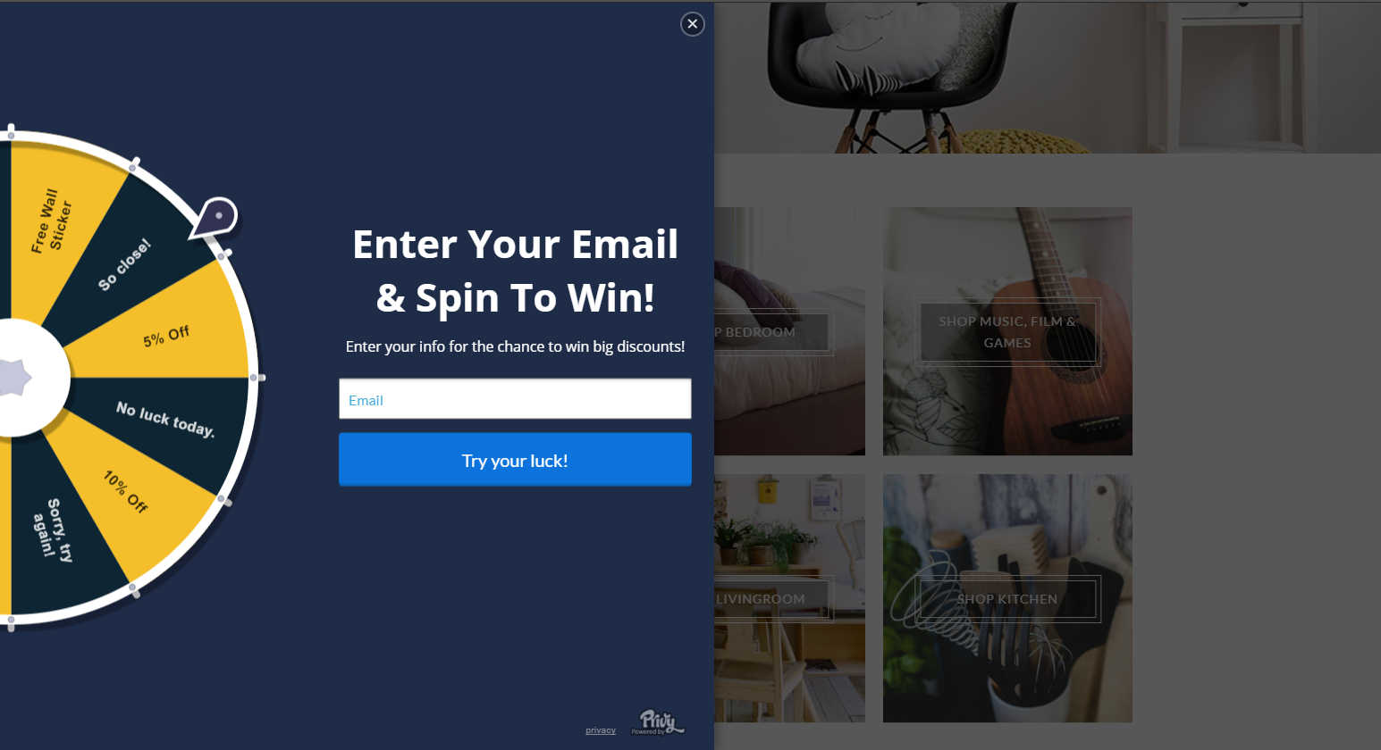
But you can capture a small piece of information.
Simply getting an email address will make sure you stay in this potential customer’s consciousness.
Use heat mapping and session tracking to find out on which pages your customers are leaving the site. Then add an intent based pop up with a data capture field.
A great way to entice customers to leave an email address is by offering a discount code there and then. This doesn’t necessarily improve user experience from a navigation point of view, but your customers will feel like they are getting something for free, whilst you gain valuable email addresses.
This way, you can target the user with possible promotions or other products that can convert them into customers.
Combining A/B testing with clickmaps for increased effectiveness
By implementing A/B testing, it’s easy to find out which version of a changed homepage would work better. When you combine the knowledge from click maps with this kind of testing, you can increase the effectiveness of your click maps many times. Sometimes you can massively improve conversions with something as simple as changing the location or colour of your call-to-action button.
The best UX
Creating a great user journey is key to guaranteeing customer loyalty and conversions. It is the best way to optimise the experience that your customers are having in your store.
Rather than spending thousands of dollars on advertising and wondering why customers just aren’t buying, create a strong foundation and an intuitive user journey. Solid, well-researched and optimised UX will ensure that your customers have no reasons to leave your site, then you can make the most out of your marketing efforts and see greater conversions.
 Shopify SEO Audit TODAY


