In episode two of our UX series, we are focusing on something that always needs to be considered when designing anything, and is especially applicable to web design. It applies to everything from styling, right through to the design language and the full expression of the brand itself.
This time, we’re talking about ‘Consistent Design for Web’.
What is Consistent Design?
consistent /kənˈsɪst(ə)nt/
adjective
acting or done in the same way over time, especially so as to be fair or accurate.
Consistency in your design means:
- keeping the brand’s story alive;
- ensuring the user interface is solid;
- the user experience is simple
Being consistent can lead to better accessibility which can have a positive effect on your customers and your rankings on Google.

This is key for both web development and design. Visual elements such as photography, typography and CTAs, and the use of the brand’s language can all help your customers. When they return to your site, they will feel comfortable and able to easily interact with your Shopify Store through learnt behaviour, resulting in them coming back time and time again.
Ensuring that your store is cohesive and works in harmony across multiple pages and platforms can be difficult. This is where our Design and UX teams at Eastside Co can help you achieve a perfect balance of where your content is, how it’s portrayed, ensuring it all comes together consistently - all backed up by research and data. This makes for a healthier customer journey experience.
Consistency in Design has many factors; here we will examine our top five most important.
1. Visual Elements
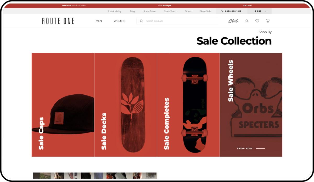
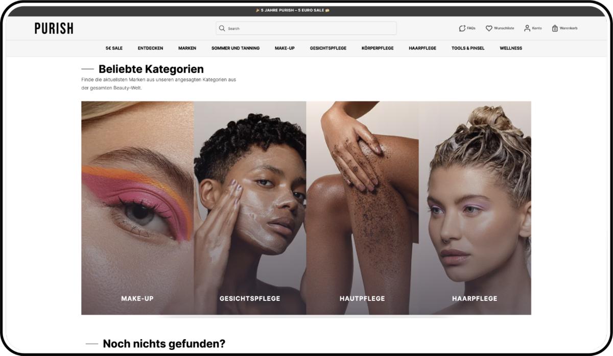
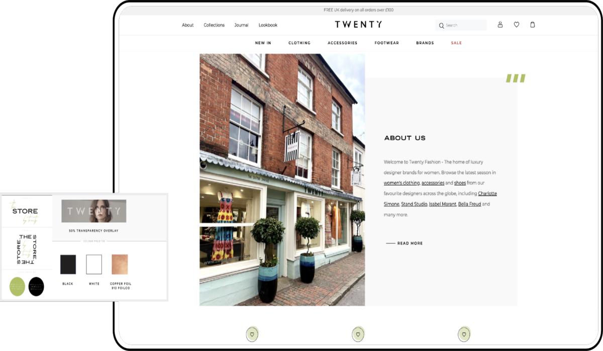
The first and easiest to identify on an ecommerce website is the visual elements of the page. We refer to this as the ‘UI’ or the user interface, consisting of colours, imagery, typography and many more. Other components of this are the CTAs (Calls to Action), product cards and the navigation. Any other elements that your website uses and shows to your customers should always stay consistent visually. Maintaining these consistencies across your ecommerce store WILL bring harmony, making your user experience immediately recognisable and cohesive.

2. A Simplified Website
Whilst effective visuals keep your website looking good, making sure that you keep things simple too is an art form. Creating space and keeping your site clutter-free will enhance your user experience. Too many styles applied to your site can overwhelm users, confusing them and leading to a higher bounce rate, with people leaving your site, rather than a conversion or sale. Looking at what you have and cutting it back can be an effective way to make it much simpler for customers to understand you and your brand better.
3. Functional Consistencies
Though consistency is defined by the visual aspect, functional consistency is defined by the site’s overall usability, which helps your users to get acquainted with elements quicker and learn what they mean.
Think of a mobile navigation: you expect to have a burger menu either in the top left or the top right corner of your browser. This functional and learned behavioural consistency should be exactly what you expect on each page you visit.

4. Internal Consistencies
The Internal Consistencies are combinations of both the functional and the visual consistency - referring to the change or addition of content to a site. With both functional and visual, it’s vital that any changes made stick to your guides.
Here’s an example. If you want to add a new link on your navigation bar, you want to be certain that the styling is the same as that of the others. However, if you are adding a link that is meant to be different, such as a promotion or a subscription based service, then draw these out with a primary action, but still match the rest of your internal consistencies.
5. External Consistencies
Whilst the internal consistency relates to your site, the external consistency is both the visual and function outside your site, from your social media platforms right through to your customer service language and to your (if any) interactional ecommerce stores.
Keeping your design consistent from an external point of view should lead your users to trust you, enabling you to become a bigger player in your sector.
Final Thoughts
Having full consistency will leave you and your users feeling more comfortable, allowing you to grow due to more customers converting. Having your new and returning customers learn the UI faster and with ease can give you that boost your conversion rate needs. Ensuring you have successfully implemented the internal consistency correctly and combined both visual and functional consistencies, will in turn, allow you to reach newer heights with your external audience across the world.
If you’d like to talk to us about how we can help create a consistent design experience for your brand, get in touch!
UX Part 1 - Simplified UX Processes


