What Do We Mean By 'Expectation' In UX?
When we talk about ‘expectation’ in UX we mean when the user is able to easily predict what is going to happen next: it allows users to feel at home and familiar with the journey they are taking. In order to create this feeling, logic and best practice needs to be adhered to, keeping users from second guessing.
How Should You Meet User Expectations?
People have developed patterns of behaviour and have come to expect certain next steps in an online journey after years of practice navigating around ecommerce websites.
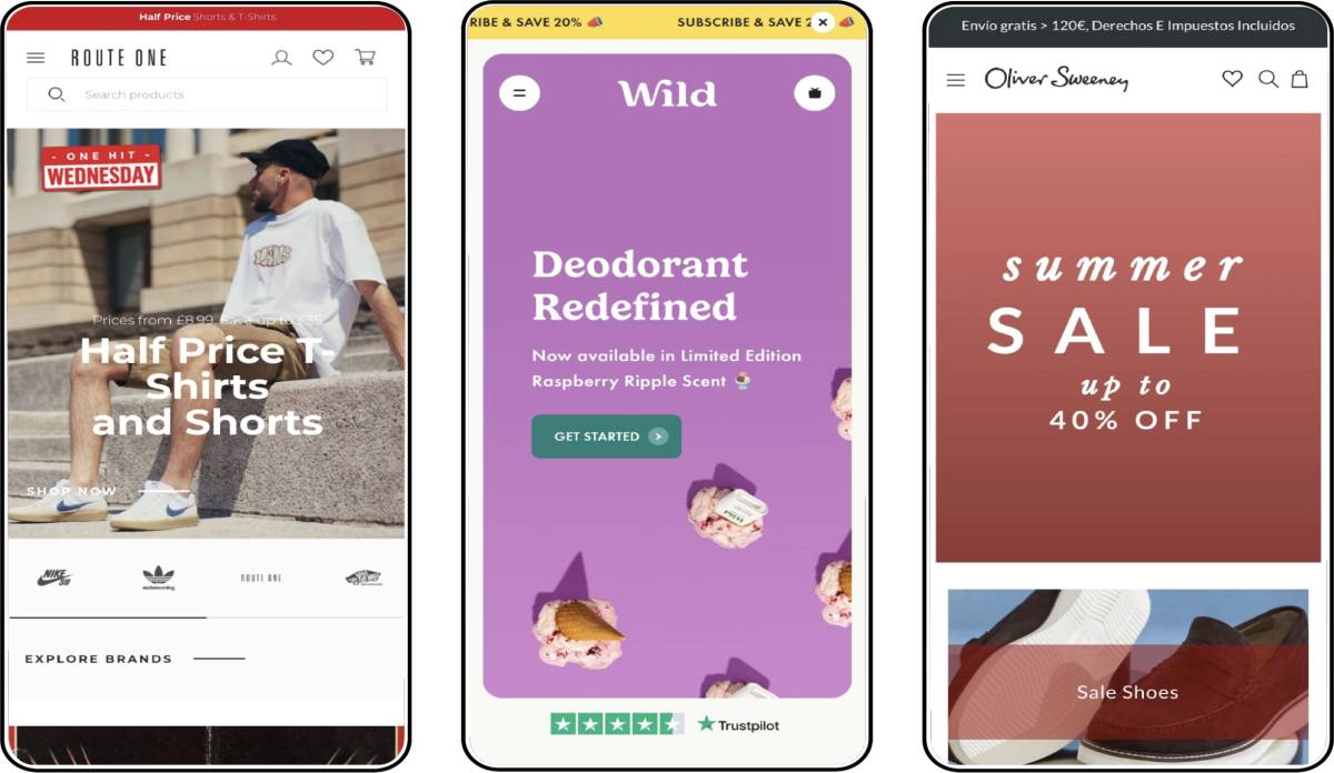
As a quick example, whether you're on a fashion website or a supermarket site, there will most likely be three lined icons, either in the top left or right of your mobile device. In the UX world we refer to this as a burger menu. Amending this feature or changing it beyond recognition may cause confusion in the user and undermine the experience you’re trying to create. Examples like this demonstrate why it’s very important to keep your users aligned with what they are expecting, resulting in a better experience all round.

Context In Design
This is massively important - it gives users the ability to predict follow-up actions when they have triggered something. So if they click or tap the burger megu, the expected experience here is that a menu will open, giving the user options to navigate through the site with ease. Another example is what we as UX designers refer to as a Call to Action, for example a button that you’d like your users to click, resulting in them taking the next step on their journey.
Ensuring the CTA is correctly labelled gives it the necessary context. For example ‘Shop The Range’ gives more context than if the button simply said ‘Go For It’ which would make your users feel confused about where the button is directing them. Make sure you label everything and properly allow your users to engage with the site. If, for example, your brand has a tone of voice like no other, then applying messaging around the call to action will give context, giving the button purpose and providing a sense of direction.
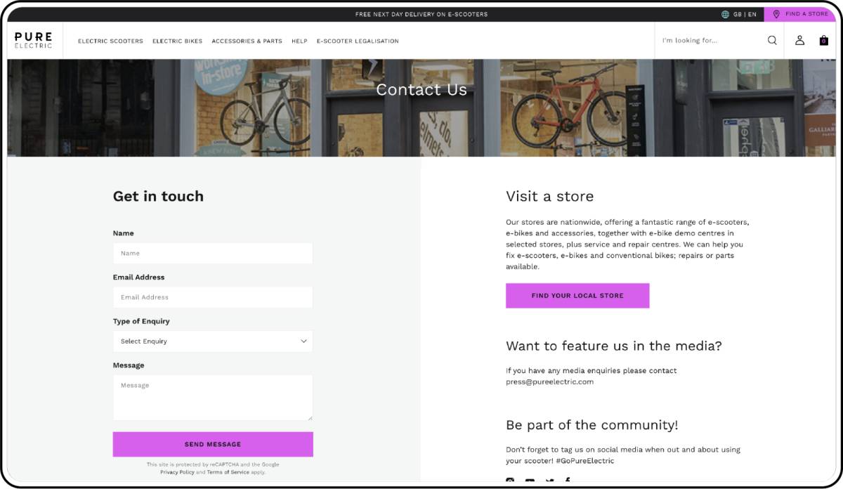
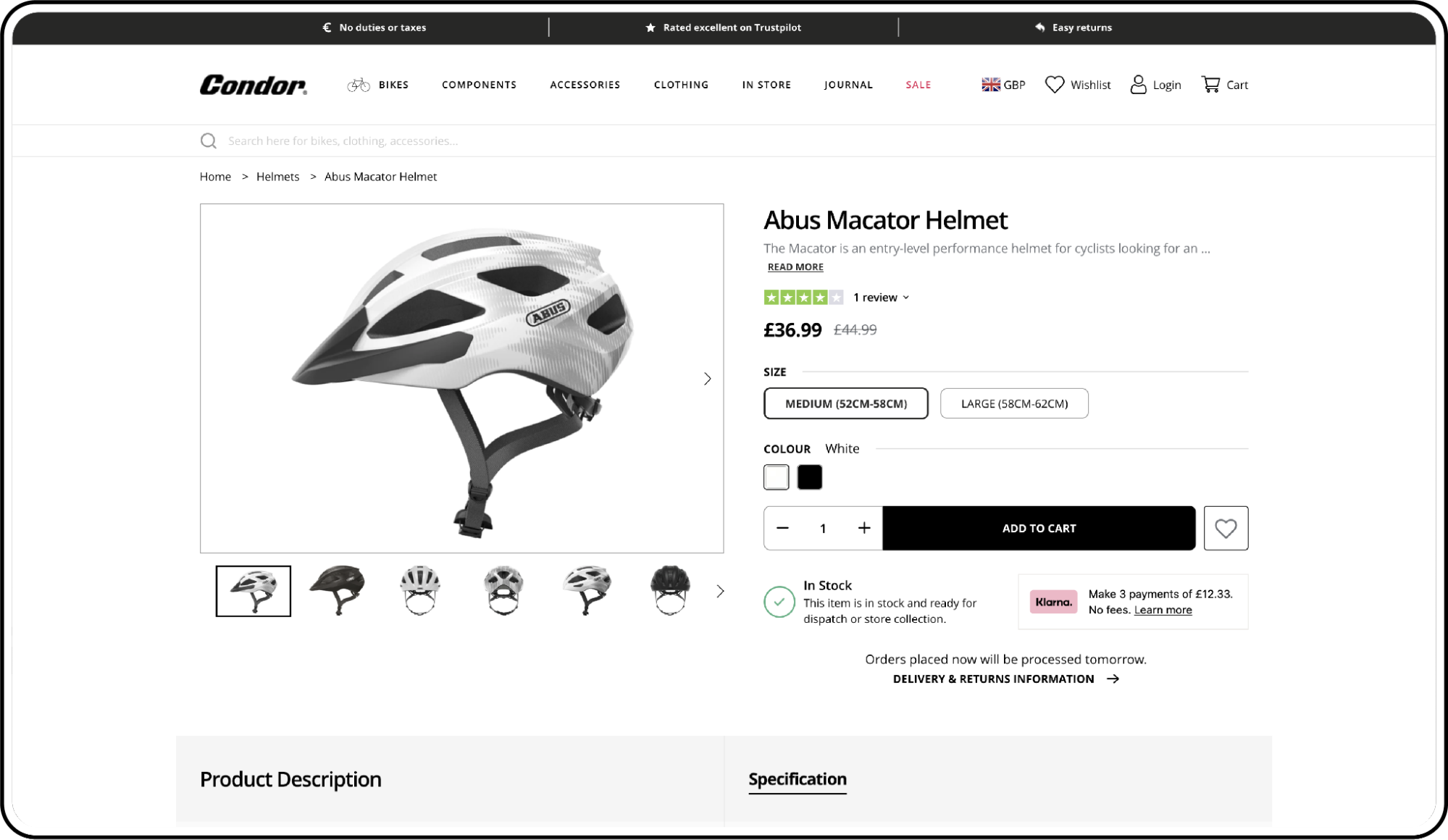
Text labels on fields give users context on what they need to populate the field with, but do make sure that the field title is visible at all times. Descriptions and other forms of captions for images help users to understand its context, which also helps with SEO and accessibility.

The Perfect Way to Improve Your Users’ Expectation
Whenever labelling a call to action/button, keep it simple and don't waffle (you only have a limited space). With that, never, and we mean never, tell the user what to do. For example, if you have a button that reads ‘Click Here’ or ‘Click Me’, your user experience is not right as you’re trying to force your user into an action without any context or providing a compelling reason to do so.
You also shouldn't need to let your user know that the call to action is tappable or clickable, or that they need to scroll down a page. This is considered bad practice - site users tend to naturally scroll. As an alternative, you could provide a hint that they can scroll by showing a peek of the next piece of content further down the page.

The Importance Of Delivering Expectation
Having the right expectation connects users to their past experiences, hence the term ‘user experience’. Making sure your users don't have a hard time when navigating through your site is tough but data will allow you to see where improvements can be made, using tools such as user testing, heat maps and analytics. Being consistent and clear when being exceptionally predictable makes for a simple journey to a conversion or sale.
Best practice and accessibility play massive roles in all this, which have all come from best research practices and really understanding about human emotion. Abiding by these rules will give your store the best possible outcome in terms of how your users interact with and enjoy navigating your site.
If you're looking for web design support, get in touch with our team today.
UX Part 1 - Simplified UX Processes


