One of the toughest tasks we’re faced with today is getting noticed online. With competition around every corner and distraction down every scroll, consumers aren’t so quick to engage with your content any more.
But when they’re browsing to buy it’s a whole different story! Since they’re exploring with the intent of spending money, they’ll pay attention to every detail, whether they realise it or not.
This is why the product page layout and design on your ecommerce site is crucial
When users land on your product page, you’ve really got the upper hand because now you have their undivided attention. If you want to turn browsers into buyers you have to play your cards right and consider human psychology as an underlying part of your design process!
Check out our range of Shopify web design services.
But considering the changing behaviour of humans as buyers, human psychology is probably one of the most complex topics to discuss in our industry. That’s why UX has become so important in the digital space. You must continue implementing user behaviour research if you want to keep adapting and succeeding. (Learn more about how we can audit your store and enhance it for better usability and more sales.)
Our digital landscape may be changing significantly, but like the marketing pioneer Claude Hopkins said, “the principles of psychology are fixed and enduring. You will never need to unlearn what you learn about them.” But you can – and should – keep expanding your knowledge. To emphasise how important this way of thinking is, let’s go back 16 years.
Science is the future of marketing – and the future is now
Harvard Business School professor Gerald Zaltman is renowned for his ability to bring knowledge and practice together. He served as Director of the ‘Seeing the Voice of the Customer Laboratory’ at Harvard Business School and was as co-director of the ‘Mind of the Market Laboratory.’ Later on he also co-founded Olson Zaltman Associates, a market research and consulting firm that has worked with many Fortune 500 corporations including Procter & Gamble, Coca-Cola, Frito-Lay, Audi, Kraft, and Cisco. This guy is good.
During an interview in 2003 he stated that 95% of our purchase decision actually occur in the subconscious mind. Is this still the case today? Well, you can read the full interview here, but one answer in particular really stood out:
Q: “We hear a lot about how technology is revolutionizing our ability to understand customers. Is this aspect overrated? Is science the future of marketing?”
A: “Technology is indeed revolutionizing our ability to understand customers. Insights about the workings of the cognitive unconscious including memory, attention, information processing, the nature of human universals, and socially shared cognitions, and the neurobiology of figurative thinking, for instance, have already outdated most thinking and current practices among managers. Many of these advances are the product of advances in research techniques. Still, the use of scientific advances requires the imaginative translation of scientific findings into effective practice in the marketplace. This is the art that goes hand-in-hand with science.”
Imaginative thinking as an application of science. Now that’s beautiful!
In short: consider human behaviour research as a science and couple what you learn from it with your understanding of emerging trends and technological innovations, and you’ll create product pages that are both enticing and highly effective.

We’re going to show you how we’ve done exactly that on the web design of one of our own clients, focusing specifically on their product page layout. By highlighting how we’ve implemented some of the basic principles of UX design, we’ll help you understand how certain decisions – even the smallest ones – can have a massive impact on your user’s behaviour, and ultimately on their buying decisions.
Otto Copenhagen: see for yourself
Vision triumphs all other senses because sight is the primary way we navigate through everyday life. In fact, 70% of all our sensory receptors are in our eyes. Hear or read a piece of information, and three days later you'll remember about 10% of it. But if you add a picture, you’ll remember about 65%.
Of course that means video will have an even greater impact because it’s including an extra sense, but adding audio to an auto-play video on your website is not a good idea! Having unexpected sound blare through your speaker and not knowing where it’s coming from is anyone's worst nightmare. So consider the effectiveness of video when you implement interactive content in your marketing, but stick to powerful visual content for your website.
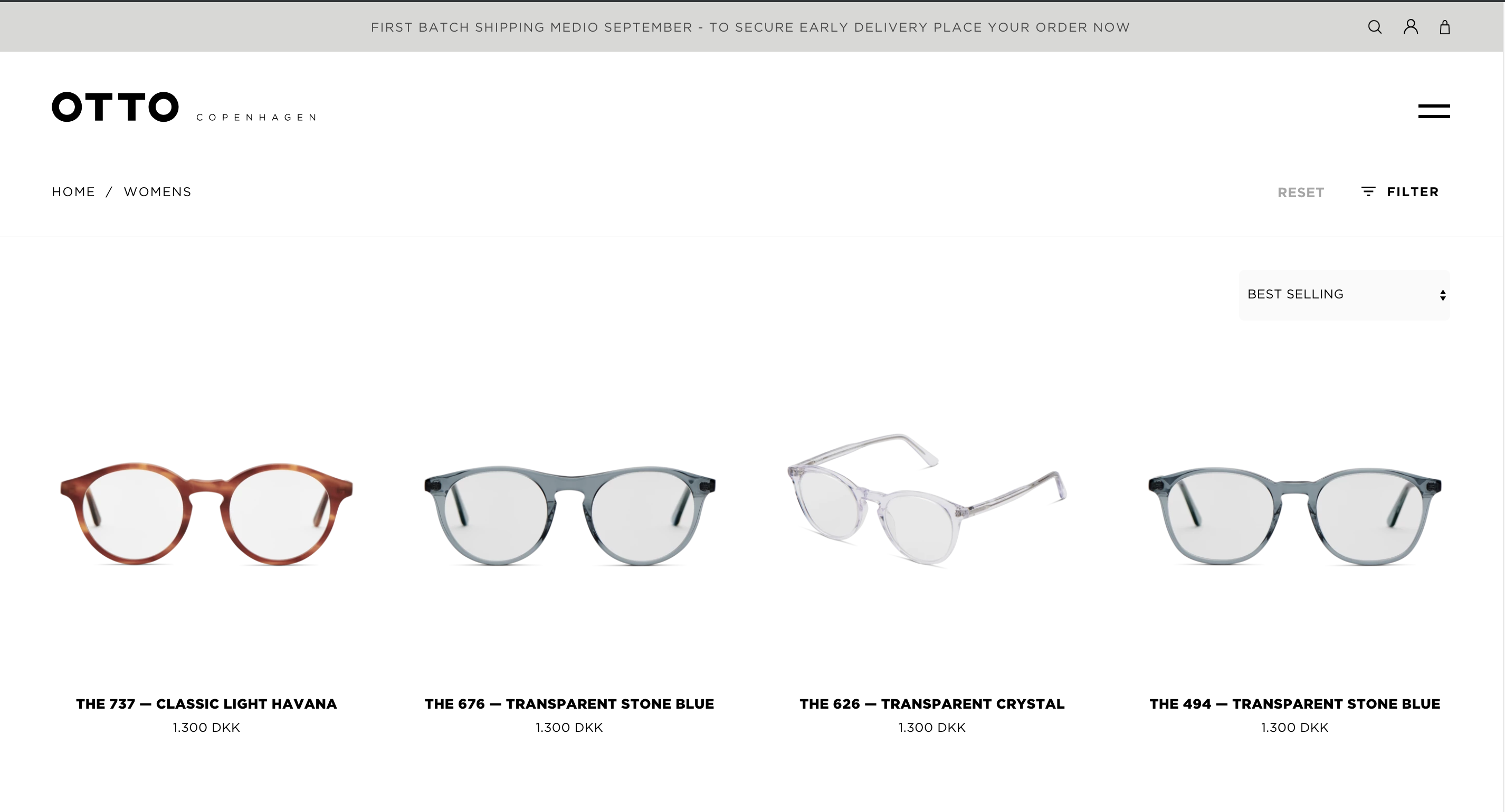
Otto Copenhagen’s product pages deliver visual excellence because they follow the fundamental rules of good UX and UI.

Avoid visual clutter and keep things simple by implementing a clean background, clear and high-definition images, and minimal text. You have to showcase your products and their context neatly so there are no distractions that can cause cognitive overload.
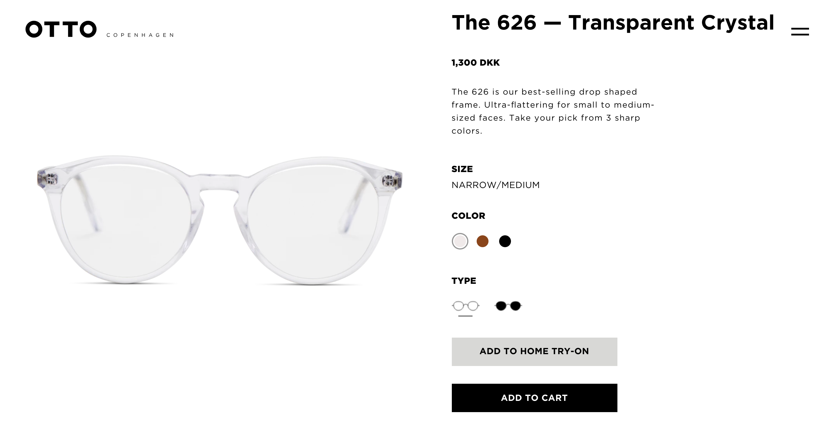
Choose layouts that make use of existing patterns so that users can recognise and navigate through your product journeys intuitively. Users must know exactly what to do on your website without even thinking about it.
This also means including clear instructions with the help of visibly distinctive buttons and well-placed call-to-actions. A purchase process can involve many steps so you have to consider multiple things at once such as visibility of system status, error prevention, user control, consistency and recognition.
Incorporate an interactive function that allows users to see your product from different angles. Your users are in a virtual store, so you have to make the experience as realistic as possible. Today, you can go as far as incorporating augmented reality into the picture. If you have the resources available, you should most definitely do it.
Include cross-selling techniques that reveal more options to your user and allow them to explore similar products easily. By suggesting alternative choices you’re giving them the space and opportunity to compare your products adequately until they can make an informed decision. Besides, browsing around your website between different product pages can have a positive effect on your SEO score! As long as they’re not leaving pages because they’re lost or uninterested, you’re still winning.
Reduce tasks by only giving users a limited amount of actionable options. Your objective is to get your users to the checkout page, so craft your journeys in a way to prevent your visitors straying off the conversion path or exiting the journey entirely.

Content makes up a massive part of product page design
Don’t compromise content for the sake of extreme visual minimalism. Content has a paramount influence on buyers’ decisions, so fine-tune your layout design until it comfortably includes all the important information your users need to know. And this doesn’t only mean product information like features, description and specs, but also any underlying valuable information that can encourage a buying decision.
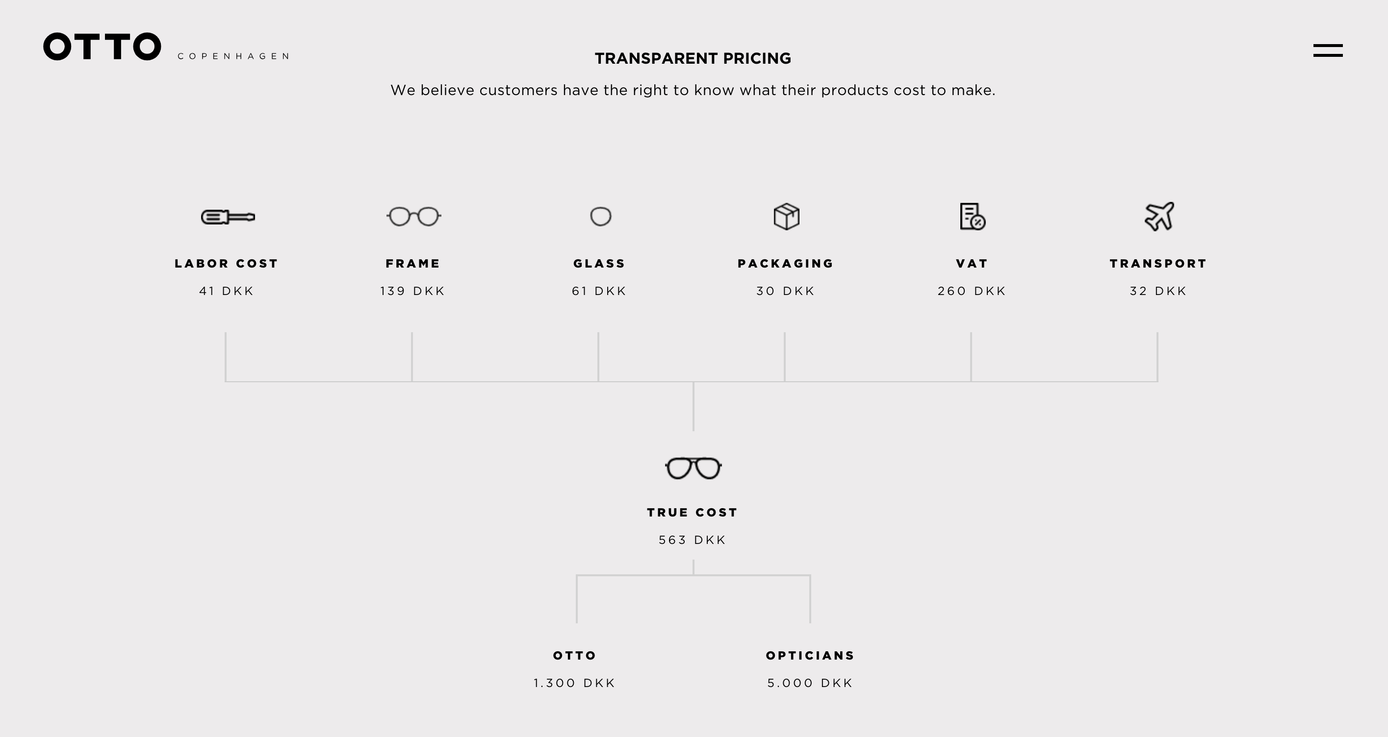
Otto Copenhagen incorporates a strapping infographic on each product page that explains their transparent pricing structure. Consumers are smart and are gaining access to more and more valuable information which helps them see through unethical pricing. They’re becoming increasingly aware of how some brands may abuse markup, and so they’ll intensify their research efforts to ensure they end up choosing the best deal.
You have to understand the psychological needs of your customers perfectly if you want to bring effective design into an ecommerce website (or any piece of content you create for that matter!). In Otto Copenhagen’s case, the psychological needs of the user spreads across medical, functional, personality and lifestyle needs. By adding sensory words across their website that will reach the buyer’s subconscious, Otto Copenhagen is connecting to their audience on an emotional level and providing the clarity needed to remind visitors why they are the best brand to buy from.

Remember that Otto Copenhagen is also being ultra-specific in the content they choose to deliver, and integrating it into their journey seamlessly. Sometimes you may have information that seems extremely valuable to you from a business perspective, but that can become noise for the user on site.
You will never truly know how much the content on your website is influencing buyers’ decisions if you don’t implement UX research along with some form of user testing or A/B testing. Perhaps the information you want to include is indeed useful, but being portrayed in the wrong way so users either don’t see it, don’t understand it, or end up skipping through it hastily. Testing how your layout and the content it contains works for a real audience will give you the insight you need to polish and refine your full design.
To narrow it down, treat design as both a science and an art
If purchase decisions are made in the subconscious, then there will never be one single answer to how your product page must be designed, because there is no single answer to how the subconscious works. The golden rule is to keep on testing, analysing and improving.
You need to get experts involved if you truly want to succeed in doing this. And that’s where we come in! Our team has the experience, skill and passion to create effective, functional and highly optimised designs. We’re constantly digging for answers so that we can make mind-blowing improvements and design decisions, exactly when and where it counts.
Get in touch with us to hear how our imaginative and data-driven design approach will amplify your online sales.


