
Content Marketing Strategies for Shopify
In the competitive world of eCommerce, having a robust content marketing strategy is essential for Shopify store owners looking to stand out and succeed. Content marketing is more than just a marketing strategy to promote products, it’s a method of building trust, fostering customer loyalty, and driving sustainable growth.
For Shopify merchants, creating compelling, value-driven content tailored to their audience can significantly enhance brand visibility and engagement. From crafting engaging blog posts to leveraging SEO-friendly product descriptions and social media storytelling, content marketing provides countless opportunities to connect with potential buyers and guide them through the purchasing journey. By integrating email marketing, video content, and user-generated reviews into a cohesive strategy, Shopify businesses can maximise their impact and conversions. In this guide, we explore actionable content marketing strategies to help Shopify store owners effectively attract, engage, and retain customers in today’s ever-evolving digital landscape.
What is Content Marketing?
Content marketing is a strategic approach to attracting and engaging a target audience by creating and distributing valuable, relevant, and consistent content. Unlike direct advertising, content marketing seeks to educate, inform, or entertain users, fostering trust and credibility with potential customers. This long-term strategy focuses on solving audience problems and answering questions, ultimately leading to greater brand loyalty and increased profitability. By prioritising quality and relevance, content marketing helps businesses build meaningful connections and stand out in an increasingly competitive digital landscape.
Content Marketing Statistics
The effectiveness of content marketing is evident in a wealth of statistics that demonstrate its value. Over 80% of marketers worldwide use content marketing as a core part of their strategy. Businesses that maintain a blog generate 67% more leads than those without, and approximately 47% of buyers engage with three to five pieces of content before making a purchase decision. Video remains a key format, with 54% of consumers preferring video content over other types. Furthermore, content marketing costs 62% less than traditional marketing but delivers three times as many leads, underscoring its importance in achieving a high return on investment.
Importance of Content Marketing for eCommerce
Content marketing is indispensable for eCommerce businesses, as it plays a central role in attracting and retaining customers. A well-executed strategy improves brand visibility, enhances customer trust, and encourages repeat purchases. By creating content that addresses pain points and aligns with customer interests, businesses can guide potential buyers through the sales funnel. Furthermore, content marketing strengthens search engine optimisation (SEO) efforts, boosting website traffic and rankings. In a market saturated with options, a strong content marketing approach helps eCommerce brands differentiate themselves and maintain long-term customer relationships.
How to Come Up with Content Ideas
Generating fresh and engaging content ideas can be challenging, but a systematic approach ensures consistent creativity. Start by identifying your target audience's needs, interests, and pain points through surveys, social media listening, and customer feedback. Use tools like keyword research platforms to identify trending topics and gaps in content. Competitor analysis can also spark inspiration, as can monitoring popular content formats in your niche. Consider repurposing existing content into different formats, such as turning a blog post into a video or infographic. Maintaining a well-organised content calendar helps to keep ideas flowing and ensures timely publication.
The Types of Content Every eCommerce Brand Needs
For eCommerce brands, a robust content strategy requires a mix of formats to address various stages of the buyer’s journey.
- Blog posts - Blog posts and articles are essential for driving organic traffic and establishing industry authority.
- Product descriptions - Product descriptions must be clear, engaging, and optimised for search engines to convert browsers into buyers.
- Visual content - Visual content, including high-quality images and videos, showcases products effectively and builds trust.
- User generated content - User-generated content such as reviews, testimonials, and social media posts adds authenticity.
- Educational content - Educational content like how-to guides and FAQs addresses customer queries, while email newsletters and case studies nurture existing relationships.
Your content marketing strategy underpins all your other digital marketing efforts and if you want your Shopify brand to excel, you have to make sure you understand every strand of it. To start, remind yourself about this one important fact:
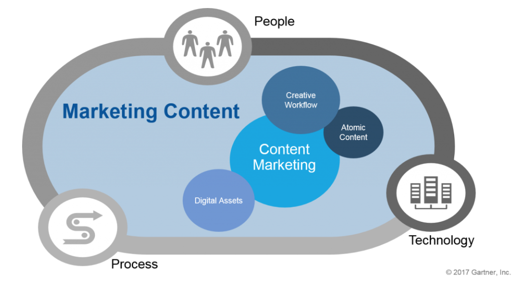
There is a difference between marketing content and content marketing
Content exists everywhere, so it’s a tricky thing to grasp at first glance. Think of it this way: all content marketing is marketing content, but not all marketing content is content marketing – what a tongue-twister! It’s basically the same as saying that all thumbs are fingers, but not all fingers are thumbs.
Marketing content encompasses the broad spectrum of all content assets in your marketing division, from product specs, customer-service and advertising to company information and public relations. It has existed in marketing from day one as an integral part of any brand’s success.
Content marketing is a data-driven, strategic approach to content creation that works as an individual system with structures and subsets of its own. It’s designed to attract a targeted audience to a brand-owned platform or profile with the goal of growing an audience, building trust and solving specific problems. It’s a unique sector responsible for following a human-centric strategy, and it relies heavily on technology and data.
Content marketing is advancing to make this difference almost invisible
The two practices evolved from entirely different tactics, but they’ve grown inseparable because they make use of (or support) many of the same digital aspects and features. The marketing world is multifaceted and interchangeable, so if one is suffering, the other is likely to suffer too. Plus, when integrated online, they both have a huge impact on social currency. In short, the two are not the same, but soon they will be.
Once you’re on the path of brand building you start setting expectations for your audience. Content marketing is the sector responsible for meeting and maintaining those expectations. It makes use of a clear-cut strategy, a well-planned objective and a user-first spirit.
Traditional and native advertising that deliver cold, commercial messages to a mass-audience aren’t as effective as they used to be and can’t compete with the power of content marketing. Not only are people sick of interruptive and repetitive marketing, they’re also spoilt for choice and subsequently swarmed with basic marketing content. Now they prefer engaging, informative and entertaining content.
Content marketing presents itself in many different forms like articles, podcasts, videos, infographics and so forth, but whichever form your content marketing may take, it should always be relevant, valuable and consistent.
Here are some content marketing statistics:
- 40% of marketers have a well-documented content marketing strategy,
- 71% of content marketers reported that content marketing has grown in significance in the past year,
- In 2023, 62% of B2B businesses intend to leverage AI content generation tools for content marketing efforts,
- 78% of content marketers reported that their organizations plan to invest or continue investing in video,
- 48% of marketers have a monthly content marketing budget of up to $5k.

Sounds easy enough, but it’s more complex than it seems. If you want to make sure you’re constantly hitting these six marks, you need to start employing the right framework.
You may already be familiar with the traditional 4 A’s Framework as presented by professor Jagdish Seth: acceptability, affordability, accessibility, awareness. But in an age where traditional window shopping and mall-trotting has been largely replaced by mobile phones, this model has expanded to include a new 7 A’s Framework, which we’re going to discuss next.
The 7 As Framework for your content marketing marketing on Shopify
Even though the 4 As of marketing are still sound and successfully implemented across multiple industries, we need to evolve our knowledge and approach if we want to keep up with and accommodate the high demands of a developing ecommerce world.
Back in the day you would lure seekers into your shop with your window displays, persuade your selectors with in-store staff and groom your buyers with customer service. Today, trading on Shopify works on the same principles, only it relies on content and technology to do so.
This framework helps us ensure that the content we create is received exactly how it was intended, by whom it was intended, and consistently so. By implementing the 7 As into your digital content strategy, you will execute your marketing with a clear vision of what is needed at specific times to generate leads and make more sales.
The 7 As Framework for content marketing in our digital age are:
- Agile
- Authentic
- Attention
- Audience
- Authority
- Action
- Acceleration
1 Agile
Even though we mentioned earlier that your strategy must be clear-cut, it’s also important that your strategy remains agile because nothing is static - especially when it comes to online marketing. Mastering an agile approach is now imperative.
Agility is essential in the fast-paced digital world, where trends evolve rapidly. An agile content marketing strategy allows brands to adapt quickly to emerging opportunities and changing audience needs. This flexibility ensures relevance and maintains competitive advantage.
Agility is also rooted in the ability to reassess existing content to improve and re-use it time and time again. An agile mindset is essential and content marketers must accept that plans are likely to change. Your ability to react, ride the wave and stay on top of the latest developments is key to your Shopify store and content marketing’s success.
2 Authentic
Content marketing needs to be authentic. This is what will set you apart from your competition and make your audience recognise you as an individual brand. Authentic content marketing creates the voice you use to represent your whole company and tell your brand’s unique story.
Authenticity resonates with audiences and builds trust, which is crucial in a landscape saturated with generic content. Genuine, transparent messaging strengthens brand identity and fosters long-term loyalty.
But when it comes to content marketing, authenticity and consistency go hand-in-hand. You need to tailor every idea you have so that it mirrors the voice you’ve already created. It’s basically saying that you have to be structured and fluid at the same time. Maintaining this fine line is where genuine creativity and skill comes in. Authenticity also comes into play when you consider your brand’s reaction to the interaction your content gets. There’s nothing more authentic than a natural conversation!
Remember, if you have a killer authentic idea, but you’re not 100% sure how to put it in line with your brand voice just yet, then don’t rush the process just for the sake of putting something out there. Sometimes it’s okay to keep a golden idea on the back-burner until every other aspect and feature in your strategy will support it.
3 Attention
Capturing and retaining audience attention is vital in an era of information overload. Eye-catching headlines, engaging visuals, and compelling storytelling help brands stand out and sustain interest.
The golden rule for attention-grabbing is to have an excellent headline, but you can’t rely on that alone any more. Images and captions are now equally important. This is partly because of the UI of social platforms, but also because clickbait has created a negative reputation in the content marketing industry. Your headline should never reflect anything dishonest or exaggerated, simply for the sake of a click. Firstly, consumers can see right through it – clickbait (previously known as yellow journalism) has been around for over a century after all. Secondly, you’ll increase your bounce rate and hurt your rankings. And thirdly, you’ll diminish your hopes of becoming a reliable source and potentially lose some of your audience along the way.
If you want to be relevant, authentic and stand out at the same time then you should look into implementing interactive content into your content marketing ideas.
4 Audience
A deep understanding of the target audience is the foundation of effective content marketing. Creating tailored content that aligns with their needs, preferences, and pain points ensures maximum relevance and impact.
Your audiences are such a delicate thing and if you don’t treat them with great care, you’re not going to win. They are your power-house of knowledge, feeding you rich information about who they are, what they want and need, and how you can develop your products and services to improve their lives.
As a content creator, promoter or marketer for any industry you have to think of your audience as your buyers – even if they aren’t buying yet. Exposure to your audience is crucial no matter which part of the customer journey they’re on.
Your goal is to become the Shopify brand that stands out through your own efforts, but also through word-of-mouth. If you want to become the word on everyone’s lips then you have to work on attracting your audience to an optimised experience, and make sure that your content is considering the customer journey SCALE model entirely.
You’re not here just to get attention – you have to give attention too. Remember that you’re potentially sharing an audience with competitors of your Shopify business as well, so you have to nurture them wholeheartedly if you want to keep them from slipping into the hands of another brand.
5 Authority
Once you’re successfully putting the first four As into your strategy, you’ll start to see your brand authority improve. If you give your audience relevant and honest content when they want it in a way that they can enjoy, they’ll start coming back to you as a reputable source. Ultimately you need to instil the idea into your audiences’ minds that you are the most trustworthy online brand they can rely on in that moment.
Establishing authority through high-quality, well-researched content positions brands as industry leaders. Sharing insights, expertise, and solutions builds credibility and trust with audiences.
It’s not always easy to keep their trust, however. With so much regurgitated content and fake news cluttering the internet these days, consumers are sceptical about what they read and will most likely take the time to compare your content with competitive authority. So, you won’t always win, but that shouldn’t stop you from trying. Here are a few tips that will help you build and maintain a sense of authority:
-
Place your content in a practical context. Exclusive tips and personalised offers will deepen engagement and help customers get more out of investing their time into your Shopify brand.
-
Solve problems with self-serve utility. It doesn’t count if your consumers have to break their backs trying to find the information they need, so put the right answers out there before they even think of reaching out to ask. When they find and share information on their own, they will also gain a sense of authority - all thanks to you.
-
Prioritise customer lifetime value and reward loyal readers. This goes hand-in-hand with giving your existing audience the well-deserved attention they need.
-
Spark meaningful discussions that promote a worthy cause. Today, your mobile or laptop acts as an extension of yourself, so when you open it you want to read about things that matter to you. If you become the ecommerce brand that talks about issues your consumers are interested in, you’ll establish a stronger connection and gain invaluable trust.

6 Action
Encouraging user action is a primary goal of content marketing. Clear and persuasive calls to action (CTAs) drive desired behaviours, whether it’s subscribing to a newsletter, exploring products, or making a purchase.
All your efforts are meaningless if you’re not including a next step for your consumers. A call-to-action remains one of the most important aspects of any content strategy and should be approached tactically, but most importantly it must be approached gracefully. Your content marketing is there to guide your audience through the conversion funnel smoothly with the overall goal of retaining consumers. You don’t want to trick or force anyone onto a sales platform that they didn’t want to be on just yet. So, work your call-to-actions in carefully to address different objectives at a time. Work your way up from likes, shares and organic traffic to subscriptions, returning visits and finally - sales.
7 Acceleration
Your content strategy doesn’t end once a piece has been published. In fact, this is where it all starts. Today the lifespan of content shared on social media is only a few hours. Email marketing might gain you a few days, but you still only have an extremely small window of time to work with. Use that time wisely and accelerate your content with everything you’ve got – without spamming, of course. You can’t accelerate your content without a decent audience so as always, put your users first if you want to see success.
Content marketing strategies must be continuously optimised for scalability and growth. By analysing performance metrics and iterating on successful tactics, brands can accelerate results and achieve sustained success.
And if your content dies out prematurely, find the means to bring it back in a new way or at a later stage. Content will always be valuable, and if you put the right effort into making it findable and usable then your efforts to accelerate it will become easier as time passes.
Content Marketing & SEO
Content marketing and SEO are intrinsically linked, with each reinforcing the other's effectiveness. High-quality content that aligns with user intent improves search engine rankings, driving organic traffic. Blog posts, articles, and guides optimised with relevant keywords enhance visibility while providing value to readers. Additionally, backlinks generated by authoritative content strengthen domain authority. SEO also involves technical elements, such as optimising meta descriptions, headings, and alt text, to make content easily discoverable by search engines. By integrating content marketing and SEO strategies, brands can achieve greater online reach and sustained growth.
Additionally, the SEO landscape is constantly evolving with TikTok now being used as a search engine, making TikTok SEO crucial for eCommerce businesses.
Content Marketing and Email
Email marketing remains one of the most effective channels for content distribution and audience engagement. Combining email with content marketing allows brands to deliver personalised, value-driven messages directly to their audience. Newsletters featuring blog highlights, exclusive offers, and informative resources keep subscribers engaged. Drip campaigns can nurture leads by sharing targeted content based on user behaviour. Additionally, emails with educational content, such as how-to guides or product updates, build trust and loyalty. By integrating email marketing into a content strategy, businesses can strengthen customer relationships and drive conversions.
Content Marketing and Social Media
Social media platforms are integral to content marketing, serving as channels to amplify reach and foster direct engagement. Sharing blog posts, videos, and infographics on platforms like Instagram, Facebook, and LinkedIn enhances content visibility. Interactive elements, such as polls, quizzes, and live streams, encourage audience participation and provide insights into their preferences. Social media also offers opportunities for collaboration with influencers, whose endorsements add credibility. Monitoring performance metrics on these platforms helps brands refine their content strategy and identify what resonates most with their audience, ensuring a consistent and impactful presence.
Content Marketing and SMS Marketing for Shopify
Combining content marketing with SMS marketing offers Shopify store owners a powerful strategy to engage and convert customers. While content marketing focuses on creating valuable and informative materials such as blogs, guides, and videos, SMS marketing delivers concise, time-sensitive messages directly to customers’ phones. Together, these approaches enhance customer engagement by providing value through content and immediacy through SMS. For example, sharing a blog link via SMS or promoting exclusive offers can drive traffic and sales. This integration ensures a cohesive communication strategy that strengthens brand loyalty and boosts conversions efficiently.
Conclusions
Content marketing is an indispensable tool for eCommerce success, particularly for Shopify store owners aiming to thrive in a competitive digital landscape.
By implementing a thoughtful strategy that combines SEO-optimised content, engaging social media posts, and personalised email campaigns, brands can effectively capture attention, build trust, and nurture lasting customer relationships.
The versatility of content marketing allows businesses to address audience needs, showcase their expertise, and inspire action, ensuring long-term growth and loyalty. By staying agile, authentic, and audience-focused, Shopify merchants can create meaningful connections and stand out in a crowded market.
Embracing the principles of the 7 As framework and leveraging the synergy between content marketing and other channels provides a clear path to sustained success. With the right approach, Shopify businesses can turn content into a powerful driver of engagement, conversions, and brand loyalty.
How to make the 7 As framework effective in your Shopify content marketing strategy
You can start by calling us. Our content team is on top of all existing, evolving and emerging marketing trends in the world of Shopify. We know that content is the lifeblood of everything a brand does and we’re dedicated to doing it right to maximise success for you and your audience.